iOS 18.2 represents a substantial update for users. While new Apple Intelligence features take center stage, the Mail app undergoes its most significant redesign to date. Here’s a comprehensive overview of what’s new.
Mail app redesign resembles Messages
Upon launching the Mail app in iOS 18.2, the redesign becomes immediately noticeable. Although the mailboxes interface remains familiar, opening an inbox reveals several major updates.

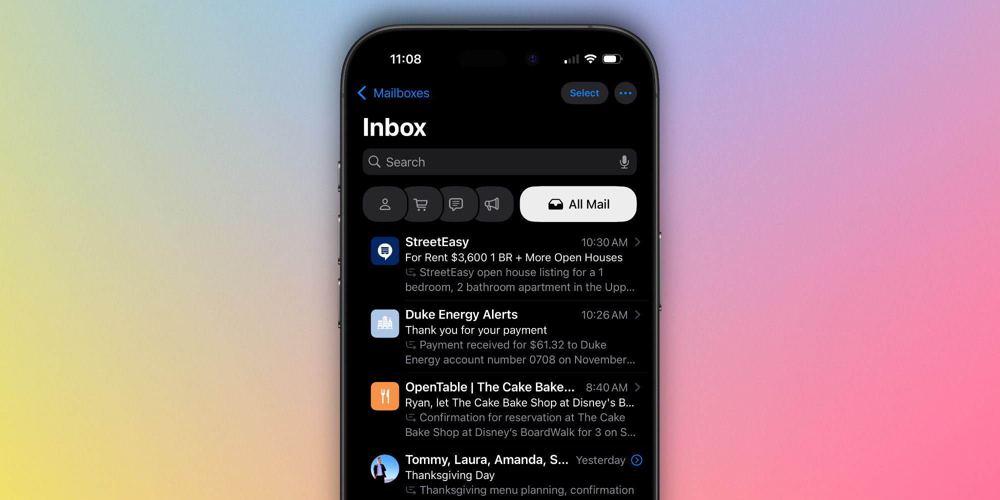
Visually, Apple is now focusing on displaying contact photos for senders as part of the inbox view. Instead of just text, you will now see vibrant colors and images. Essentially, emails in your inbox now resemble threads in the Messages app, showcasing a contact photo on the left.
This modification aligns with Apple’s new Branded Mail features for businesses. Companies can upload their logos to serve as contact images not only in Mail but also in the Phone app and Apple Pay interface during contactless transactions. If a business hasn’t completed this, then icons from Apple Maps are shown instead.
Categories significantly change inbox functionality
Even more impactful than the addition of contact photos, iOS 18.2 introduces a fundamental shift in inbox organization.
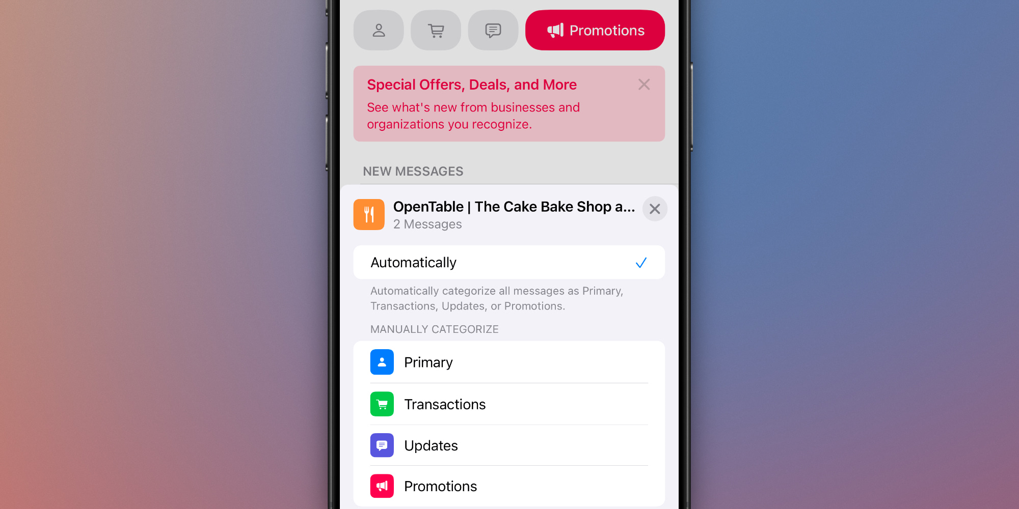
Apple Mail now automatically categorizes your inbox into four distinct groups. Here’s what they are:
- Primary: Access the most important messages here and manage everything else.
- Transactions: Monitor your orders, delivery notifications, and more, organized by sender.
- Updates: Keep tabs on everything from newsletters to alerts in one section.
- Promotions: Discover the latest offerings from familiar businesses and organizations.
Emails are sorted into these categories as they arrive, with each category further divided into ‘New Messages’ and ‘Older Messages’ sections.
As a thoughtful addition, you can configure Mail’s notification badge to display only the count of new messages in your Primary category, or maintain the previous setting where all messages are counted.
Adjusting Mail’s system or opting out

If Apple’s categorization places emails in an undesired category, you have the option to make manual adjustments that persist going forward. You can set specific senders to always direct their messages to a preferred category rather than relying on Apple’s automatic sorting.
Additionally, if you’d rather avoid the new category system, there are two ways to revert to your previous unified inbox layout:
- By default, the Mail app displays the four listed categories. However, you can access a hidden ‘All Mail’ view that remains available. You can simply swipe left to switch to the ‘All Mail’ view, regardless of which inbox category you are viewing.
- Alternatively, if you want to completely disable the categories, tap the three dots in the top-right corner and select the option to switch from Categories to List View. This will restore the inbox sorting to its pre-iOS 18.2 configuration.
Messages consolidated in a Digest view

Lastly, there’s another notable adjustment to how your inbox functions.
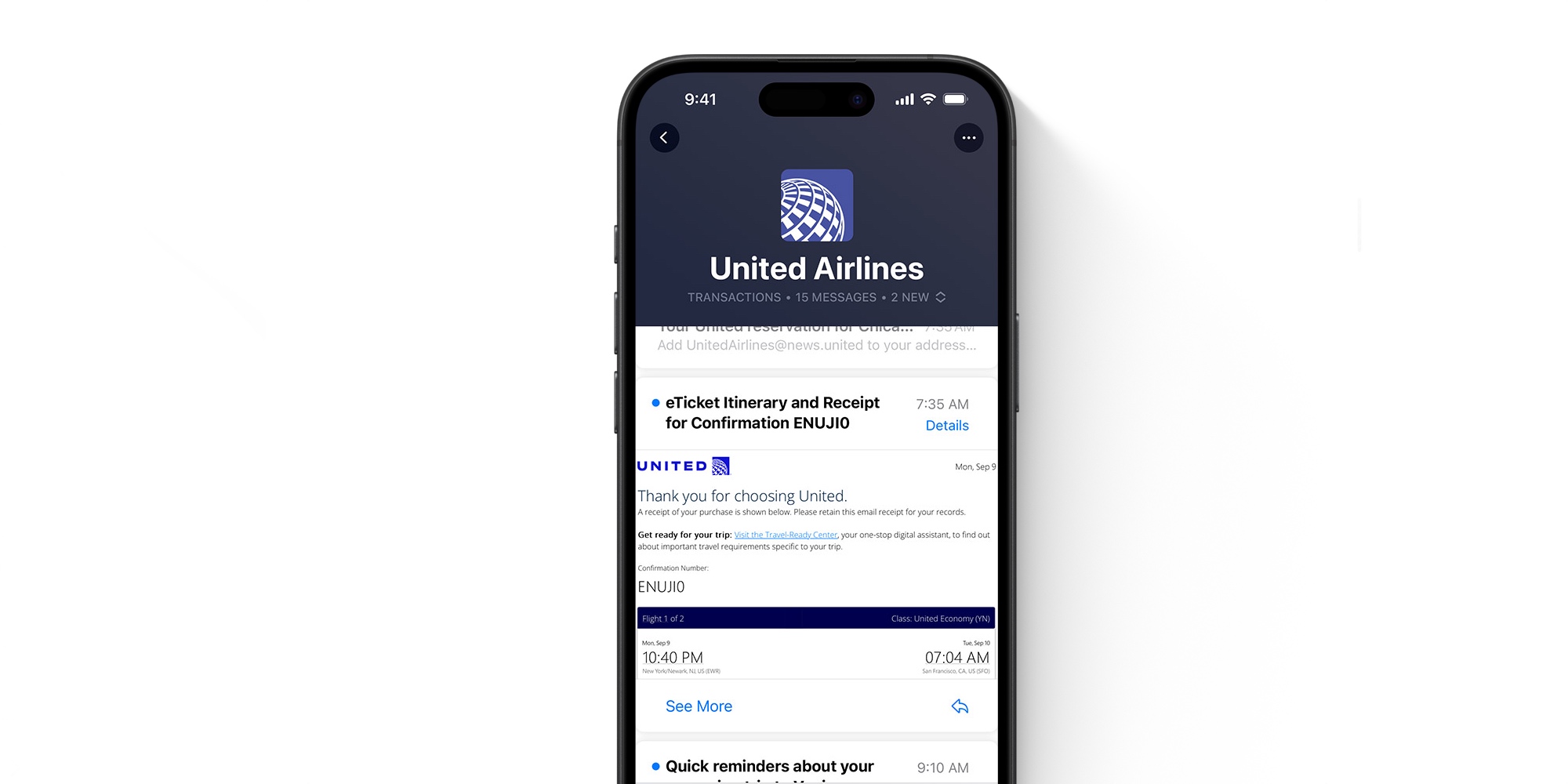
While the ‘All Mail’ view displays every individual message, the new category sections aim to streamline your inbox experience.
They achieve this by grouping messages from the same sender together and presenting a new ‘Digest view,’ as illustrated above. However, as with most features in iOS 18.2, you have the option to disable this functionality if it’s not suitable for your needs.
Summary of the iOS 18.2 Mail app
Mail is one of the few highly popular iPhone applications that historically has not seen many updates from Apple. However, the redesign introduced in iOS 18.2 changes that narrative.
I have thoroughly enjoyed experimenting with the new Mail app in the iOS 18.2 beta version, but I’m also pleased that Apple has made it easy to disable various changes for those who prefer the previous setup. With this significant redesign of Mail for iPhone, I’m eager to see these enhancements roll out to the iPad and Mac as well.
What are your thoughts on the Mail app’s redesign? Share your opinions in the comments.
Top iPhone accessories
: . More.


