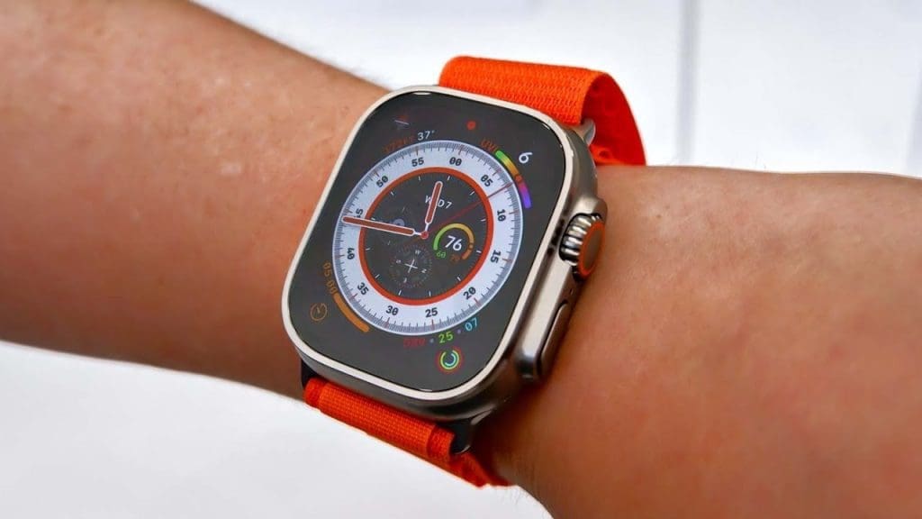
The Apple Watch Ultra, the most expensive smartwatch from the tech giants, had relatively disappointing reviews as the WWDC for this year approached. A big factor was the inability of watchOS to feel like it was made for the bigger screen. However, with the latest version 10 of the software, Apple seeks to address that issue.
What Changes With WatchOS 10
Unfortunately, the public will not be able to access watchOS 10 until at least the fall. Nevertheless, the first beta for developers was seeded within a short period after the conclusion of the keynote of the WWDC on June 5th. For those who have purchased the $99 annual access to the Apple Developer Program, the watchOS 10 is available for installation. The free beta for the public, which should also be much more stable, should arrive during the early part of July.
The first impression with the watchOS 10 will be a noticeable difference in everything. The elements in the user interface as well as the applications will be familiar. However, be ready for a complete redesign that maximizes the screen space that is available. As an illustration, the app for Music is now able to display album art for the entire screen.
Akin to the app’s iOS version, the watchOS 10 Music app can also change its color to go along with the art of the playing song’s album. The touch is nice, to say the least, and it is just one of the many such changes. However, some of the applications like Messages probably could have gone without being enlarged. In this version, all conversations are larger. This implies that only one entire conversation can appear on the screen at one time. Unfortunately, for some, this will undoubtedly feel like a downgrade.


