Stop using CARROT Weather if you have an iPad. Before you continue reading, go update CARROT to Carrot 5.8, explore its Layout settings, and select the Multi-Column Layout Style.
Yes, Carrot 5.8 is good. Your inner weather nerd will be thrilled by CARROT’s new three-column style, even if you do not change it at all. The design is a logical extension of the iOS app’s card-like interface, enlarged across many columns.
Carrot 5.8 is a fantastic update that significantly improves how the iPad’s larger screen is utilized. Users may choose and choose the information that is most essential to them and adapt each component to fit beautifully onscreen thanks to the app’s distinctive card-like customization scheme, which works flawlessly with the iPad.
Carrot 5.8 Update Is Now Available
The single-column, Plain style layout is what CARROT Weather defaults to in narrower Split View installations. The upgrade also includes the addition of an additional 10 sections of weather data, which can be shown in various ways, such as line and bar charts. There are more than enough data points and display options with the already-existing parts, which we have previously discussed, to fill three columns to your preferences.
In the same vein, Apple has created the new Weather app for iPadOS and macOS as a grid of tiles that, when clicked, reveal further information. However, I like CARROT Weather more because it gives me the option to decide what and where to display. The ability to save several layouts in CARROT gives me the opportunity to create unique layouts for various activities or seasons.
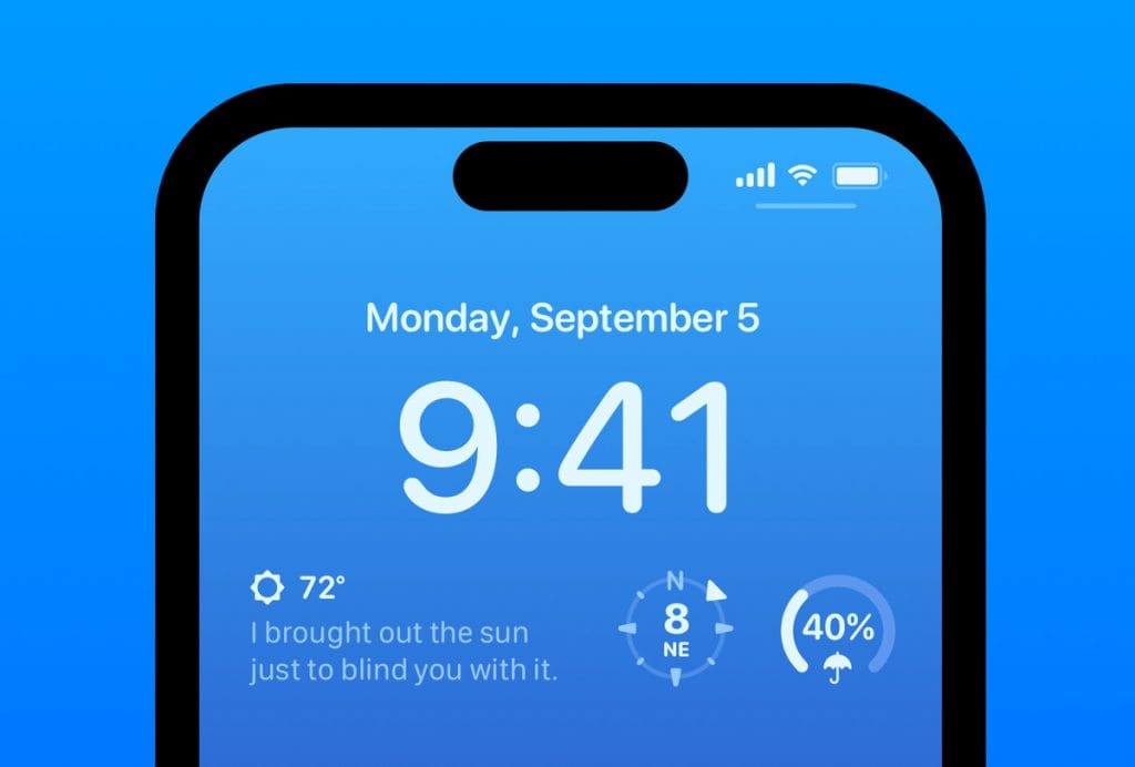
The CARROT Weather app now includes a staggering 20 Lock Screen widgets for the iPhone, in addition to the new iPad look and new sections accessible in both the iPhone and iPad versions of the program. Snark, Custom Conditions, Hourly Forecast, and Daily Forecast are the four widgets that come in the larger rectangular style.


