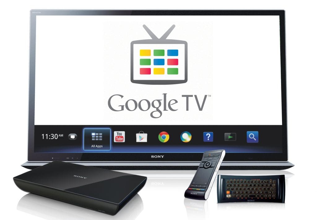
When it initially launched, Google TV was a vast improvement over every other streaming device available. The Android app for Google TV was a significant component of that update, but it has maintained the same look for almost two years. Thankfully, Google is now giving the app the Material You makeover to put it in line with its other Google apps, though without the functionality that users have been clamoring for the most (via 9to5Google).
Google TV Remote Will Be Redesigned
The bottom navigation bar is what initially catches your eye. Similar to the new Play Store design, it is now a little bit taller and the tabs are accentuated with pill-shaped icons. Along with the shortcut for the account switcher and the cast icon, the search bar occupies most of the space at the top. There aren’t many changes in the app’s other tabs unless you’re side-by-side comparing it to an older version. For example, the filter buttons at the top are still there but have changed to rounded rectangle shapes.
The only other update to the app is a background that is a slightly brighter shade of grey. Speaking of colors, the Google TV app still utilizes an off-white tone for certain sections regardless of your backdrop color and is still unable to leverage Google’s dynamic theming. It is unfortunate, but maybe Google will eventually add dynamic theming to more apps.
The navigation tabs are now on the left for a cleaner look in the tablet version of Google TV, which has also received many of these improvements. Everything else is located in a familiar area, comparable to what you get on the smartphone app, aside from the search bar and the virtual remote shortcut.


